Issue #14 | Refuting the Impact of the BTC Halving
An issue full of super simple charts, and why the halving theory is for simple minds.
Welcome to issue #14 of CoinChartist (VIP). This week’s drop includes:
Free content
Less is more. Several simple Bitcoin charts depicting an active uptrend
Are altcoins ever going to rally again?
The Dollar, Euro, the Yen, and Japan’s Yield Curve Control
Premium Content
Updated wave counts in Bitcoin versus the Dollar Currency Index (DXY)
Evidence that the Bitcoin halving is correlation, not causation, of bull runs
Remember, a premium subscripton comes with access to custom technical indciators like the Raging Bull, Trend Wrangler, and more.
You can also follow CoinChartist on YouTube and Twitter. Don’t forget to also like and comment to let us know how we’re doing.
Disclaimer: The information provided in this Substack newsletter is for general informational purposes only and should not be considered as financial advice. Investing involves risk, and past performance is not indicative of future results. Please conduct your own research or consult a qualified financial advisor before making any investment decisions. The newsletter disclaims any liability for losses or damages arising from the use of this information.
Bitcoin price has moved next to nowhere over the last several issues, certainly not resulting in the fireworks that were expected.
Regardless, a huge break in the silence is coming. Recently, the weekly BTCUSD 1W Bollinger Bands reached the tightest reading in its entire history. Low volatility always ends with a bang, so expect something historic to happen when this period of boredom finally ends.
As such, the basis of this section is to explore the technical structure and explain why Bitcoin is currently in an uptrend. And because trends persist until they show signs of a clear reversal, there is reason to expect the resulting move to be upward.
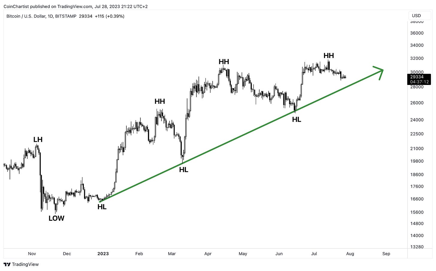
An uptrend is defined as a series of higher highs and higher lows. Dow Theory suggests that trends tend to persist until they show a clear sign of reversal. Currently, the minor 1D trend is pointed upward, and will remain that way until the green arrow trend line is violated with high volume.
On the highest timeframes, the 12M chart shows that the primary trend also remains up. The current high candle looks to be a shooting star, which would be a possible reversal signal, but falls short of the requirements. According to Bulkowski, it should feature little to no “lower shadow” and a tall upper shadow at least twice the height of the body.”
Learn more about the Shooting Star candlestick pattern.
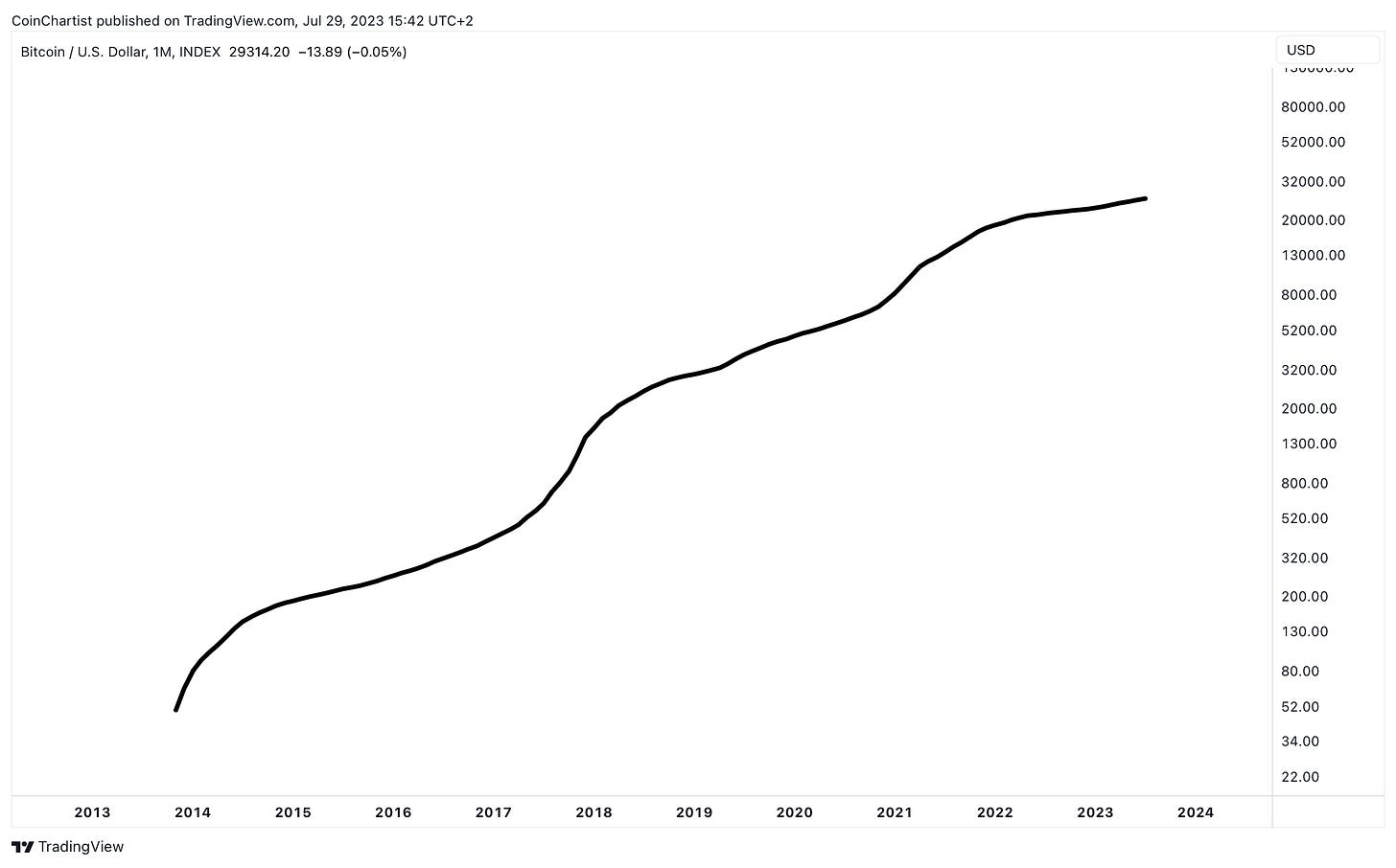
When looking at the monthly BTCUSD chart, the secondary trend is mixed. But using a 50-period moving average to show the overall trend and turning off candlesticks to remove any noise from the chart, we can see that the 50MA is making new ATHs at this very moment. This suggests that despite the struggling monthly chart, the underlying trend is just fine.
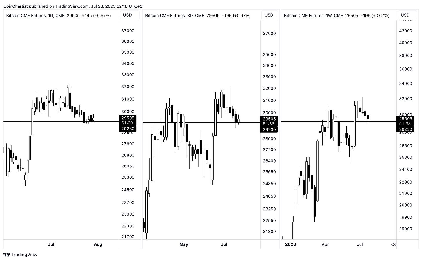
BTC CME Futures remains the most dominant chart in the space for technical signals. Occasionally, signals on spot BTCUSD don’t match up with BTC CME and it’s usually a sign of some type of fake out. The chart above shows, from left-to-right, the 1D, 3D, and 1W candlesticks. All are holding above an important level, with the weekly putting in a hammer candlestick — a possible reversal pattern.
Learn more about the Hammer candlestick pattern.
From left-to-right again, we have the 12M, 6M, and 3M, representing a yearly, half-a-year, and a quarterly charts. Here we can visible see the importance of the single black line, potentially having been flipped from support, to resistance, to back to support again. This entire process has been four-years in the making. Also noteworthy, is that price has reclaimed the largest gap in the chart. In Japanese candlesticks, gaps are referred to as rising or falling windows and represent an area of interest in terms of support and resistance.
Learn more about understanding Support & Resistance.
Altcoins appear to be largely responsible for boredom in Bitcoin. For example, BTC dominance dropping could indicate that capital is coming out of Bitcoin and into alts. But because interest in crypto is muted across the board, there has been limited price impact on BTC or alts. Still, the overall market structure remains positive, and an end of the sideways action is looming on the horizon.
We began the issue explaining how the Bitcoin Bollinger Bands on the 1W timeframe are the tightest ever. This is also the case with Ethereum, which is giving a similarly record-setting reading on the volatility measuring tool.
Learn more about the Bollinger Bands.
To little surprise, considering that BTC and ETH making up the lion’s share of the crypto market, the lowest reading of Bollinger Band Width ever is also occurring on the TOTAL crypto market cap according to TradingView’s aggregate chart. This indicates that one of the most explosive moves in the history of the crypto market is coming. We just have to be patient for it.
Learn more about the Bollinger Bands Width indicator.
The lack of any sort of real momentum is visible in the Raging Bull technical indicator, available as part of a premium CoinChartist (VIP) subscription. When the 1M TOTAL crypto chart lights up with a string of yellow candles, it will signal a return to full risk-on appetite in cryptocurrencies.
Learn more about the Raging Bull indicator. Access it with your premium subscription.
From a trend perspective, it’s mostly sideways pointed slightly up, according to the Trend Wrangler. Another CoinChartist (VIP) premium indicator, it also tends to suggest an asset is bullish above the span, bearish below it. Price is currently holding above it for several months.
Learn more about the Trend Wrangler indicator. Access it with your premium subscription.
On the 2W timeframe, we have what appears to be a fairly textbook Inverse Head & Shoulders pattern, with a target of $1.6 trillion in market cap. A breakout higher could revive interest in cryptocurrencies enough to carry the trend higher from there.
Learn more about the Inverse Head & Shoulder pattern.
The Inverse Head & Shoulders pattern on the TOTAL chart above appears promising overall, as it matches what’s going on in the macro world. Some recent changes in Japan have brought a burst of strength to the US dollar, but the recent move upward has potentially been a textbook pullback to support turned resistance.
The chart above shows the DXY at the top and EURUSD chart at the bottom. The Euro against the US Dollar shows a similar Inverse Head & Shoulders pattern, in direct opposition to the DXY Dollar Currency Index. While the DXY is pulling back to retest support turned resistance, EURUSD is performing a throwback to retest resistance turned support. The Euro makes up the largest portion of the basket of currencies that trade against the US Dollar, which is why we are seeing such a direct anti-correlation in price patterns.
The third-largest influence on the DXY in terms of currencies, is the Yen. The Yen had its most volatile day in years after the Bank of Japan announced a change in its Yield Curve Control policy. Japan was a holdout up until now among Central Banks tightening up monetary policy. This recent pressure in the Yen helped propel the US dollar higher on the DXY index.
The situation is all part of a high timeframe technical last stand. Since Monday is the last day of July, the US dollar has exactly one day left to try and hold above this key support level on higher timeframes. The large monthly candle is currently a hammer, with bullish reversal potential (bearish for crypto).
Learn more about the Hammer candlestick pattern.
On the 1D timeframe, price action has triggered a perfected TD Sequential Sell Setup. The Sell Setup appears after a specific sequence of candlesticks higher, with the sequence perfecting with a higher high. The TD count is still on an 8-count, meaning there is still chance for a very volatile Monday. The 9-candle could still push for a higher high before reversing, while a reversal at the 8-count is also possible. Another possibility is the TD Sell Setup failing, causing the US dollar to rally even higher. This situation would break the wave counts in the next section.
That’s it for free content. Behind the paywall, premium subscribers get updated wave counts in Bitcoin and the DXY Index, showing a shocking correlation that could suggest a bullish move is ahead in crypto.
Paid subscribers will also get an exclusive look at evidence that the Bitcoin halving means nothing, showing the halving date also influencing other assets.
Remember, a premium subscripton comes with access to custom technical indciators like the Raging Bull, Trend Wrangler, and more.
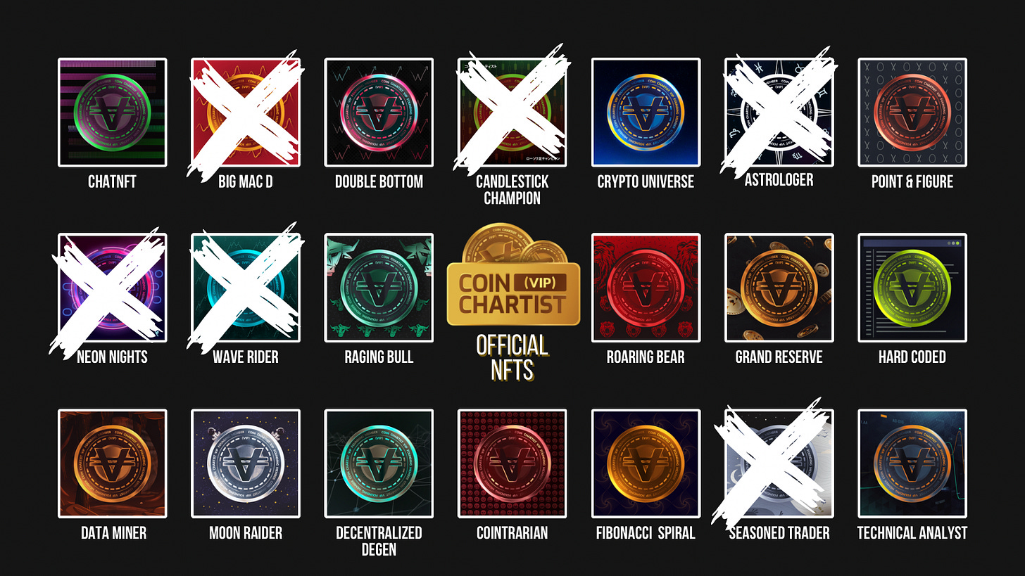
Note: CoinChartist (VIP) Founding Member Coin NFTs are available on OpenSea. Buy one there or sign up for the Founding Member subscription through Substack to secure your favorite. Above you’ll find a list of all currently available coins. Founding Member Coins enable access to a VIP Telegram channel, 1-on-1 TA training with Tony, and more.
Keep reading with a 7-day free trial
Subscribe to CoinChartist to keep reading this post and get 7 days of free access to the full post archives.


