Special Issue | "Revulsion"
The truth behind what's happening in the crypto market, and how to cope, strategize, and more.
Special Issue “Revulsion” overview
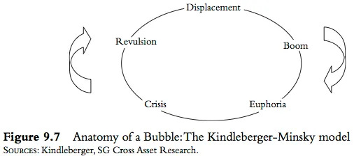
The anatomy of a bubble
What is revulsion?
Why Bitcoin ATHs are probably not happening in 2023 after all
The most bearish momentum in crypto history
Detailed alternate wave counts that explain the lack of trend
Wyckoff Theory: Is BlackRock the so-called Composite Man?
Remember, a premium subscription comes with access to custom technical indicators like the Raging Bull, Trend Wrangler, and more.
Disclaimer: The information provided in this Substack newsletter is for general informational purposes only and should not be considered as financial advice. Investing involves risk, and past performance is not indicative of future results. Please conduct your own research or consult a qualified financial advisor before making any investment decisions. The newsletter disclaims any liability for losses or damages arising from the use of this information.
In the last “Special Issue” dubbed The AI Bubble & Bitcoin’s Role, we focused our attention on the the “displacement” phase of the Kindleberger-Minsky model.
Displacement occurs when new technology disrupts a variety of job industries, yet ultimately creates new jobs and growth that spurs a price bubble.
This was clearly the case with the Internet and dot com bubble. When looking at the Nvidia chart, it is hard to argue that there isn’t some kind of AI bubble unfolding, it just didn’t influence cryptocurrencies as I had speculated (yet).
This Special Issue instead delves into a different phase in the famed “Anatomy of a Bubble” chart called “revulsion.” Where displacement begins the process of a new bubble, it is revulsion that truly ends the bubble.
Revulsion is much worse than capitulation, which we’ll highlight throughout this issue.
The goal is to ultimately explain why Bitcoin and cryptocurrencies as a whole have lost interest, momentum, and are taking a lot longer than expected to stage a meaningful recovery.
The technical tools utilized throughout this issue will provide a closer look at the underlying market conditions causing this boredom. These same tools can then be used to tell when sideways conditions are ending and momentum has returned.
Revulsion Explained
But first, what is revulsion?
Oxford Languages defines it as “a sense of disgust and loathing.”
Merriam-Webster’s definition reads, “a sense of utter distaste or repugnance.”
Cambridge Dictionary says its “a strong, often sudden, feeling that something is extremely unpleasant.”
Vocabulary.com calls it “an intense, violent, sometimes physical dislike of something.”
Wikipedia’s description points to “abhorrence, a sense of loathing, intense aversion, repugnance, repulsion, horror.”
As stated, revulsion is far worse than capitulation. You aren’t just waiving the white flag and throwing in the towel, this is the phase where market participants loathe the market so much they can’t even stand to participate any further.
Bitcoin remains mostly sideways, while several altcoins are making new lows. Between boredom and brutal price action, it feels like there could be better opportunities elsewhere. But this is precisely what revulsion is, and what’s happening across the crypto market.
Capitulating on ATHs in 2023
All throughout the end of 2022 and into early 2023, I maintained the idea that Bitcoin would set new all-time highs in 2023, or at least before the next Bitcoin halving in 2024. This idea was backed by Elliott Wave counts, cyclical timing, and more. However, given the lack of an obvious trend, this idea is fading with each passing month.
Losing medium-term momentum in June and failure to make it through $31,000 per coin has put the brakes on any sort of bull run, and this is showing up in the technicals.
Bitcoin’s monthly Average Directional Index, a measure of trend strength, shows the weakest trend since the very bottom of the 2014 through 2015 bear market. That’s only one part of the bad news: the ADX is still pointed downward and hasn’t begun to turn up.
A trend is considered valid if the ADX is above 20, which is not the case. Very importantly, pay attention to how the ADX never falls below 20 during the 2018 “bear market” nor during the COVID crash. According to the tool, the bullish trend that began in 2016 only just ended in 2023. Remember this chart when we get to the momentum section of the issue.
If the above looked not so great for Bitcoin, Ethereum’s trend strength is the weakest its ever been in its entire history. The Average Directional Index has made a significant low below the 2018 bear market. This could present some type of bullish divergence, but until the ADX begins turning up, the setup isn’t worth getting overly bullish about.
Since Ethereum arrived later in the last crypto cycle, focusing on the TOTAL crypto market cap chart from TradingView, we can see that the ADX is once again the weakest reading on the monthly timeframe ever. What this essentially tells us is that the trend in crypto as a whole is the weakest we’ve ever seen. If you were wondering why it was taking so long for a bounce, this gives us an answer. There’s very little interest in the asset class at the moment.
There are some outliers, however, and some cryptocurrencies that appear to be on the cusp of a real recovery and the start of a new trend. Chainlink, for example, is at 19.34 on the ADX and about to pass the 20 threshold. This doesn’t necessarily mean it will immediately burst into a bullish trend, but it could at least be the start of something more meaningful.
The Worst Bear Market Per Momentum
Bitcoin might have had a lesser max drawdown from all-time highs this time around than past cyclical highs, but never has momentum been this strong on the downside.
This is where Bitcoin and the rest of the crypto market begin to diverge: BTC has some positive momentum, while almost all altcoins show the opposite.
As someone paying close attention to the market and its participants, I recall crypto personality Dave the Wave suggesting that Bitcoin never had a true bear market on the monthly timeframe, as it never went below the zero line on the LMACD. This comment was made back in 2019, and as of 2022 Bitcoin officially achieved the feat and fell below the zero line for the first time ever. Importantly, momentum has crossed bullish, but remains below the zero line. Pushing above it is necessary for a return to bullish momentum.
Unlike Bitcoin which has crossed bullish and shows a green histogram, Ethereum failed to cross under to the upside and the pink weakening histogram has returned to red to show strengthening downward momentum. Interestingly, Ethereum did indeed go below the zero line in 2019, and again in 2022 and could risk teetering lower.
The TOTAL3 chart which is all of crypto minus BTC and ETH shows that the most weakness comes from smaller caps, which have fallen deep below the zero line. Bearish momentum is weakening, but if there is a return to deep red ticks on the histogram, altcoins could be in trouble. Meanwhile, crossing further up would put an end to the pain.
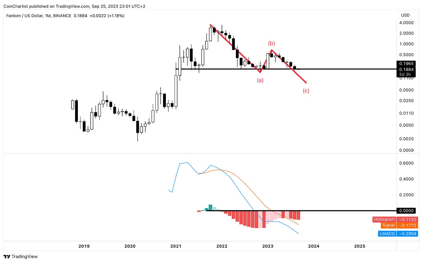
Certain altcoins have already begun to show signs of further downward momentum and structural weakness. For example, Binance Coin could collapse to a much deeper low and complete a C wave. The histogram is turned dark red and growing to show the strengthening of the bearish trend.
Another contender for a further crash lower is Fantom, which shows the deepest LMACD readings of all. In addition to looking ready to complete a C wave, there appears to be a Head and Shoulders top pattern to validate the setup.
Beware: If your altcoin’s chart looks like BNB or FTM, you might want to really dig into the fundamental side of what you are invested in. Charts that depict dangerous structural weakness tend to have something negative fundamentally driving the divergence in price action. Always do extensive research before altering positions.
The True Strength Index is yet another momentum indicator, but uses a different calculation than the LMACD to create a slightly lagging indicator, with stricter confirmation. This is the first time in history that the signal line has pushed below zero and has yet to cross bullish. This is one of the tools to watch for a clearer confirmation that Bitcoin has returned to its “true strength”.
If you want additional certainty over when things are about to turn around, Martin Pring’s Know Sure Thing indicator could give you the information you are looking for. The tool tends to fire late, but when there is a bullish crossover, you pretty much “know” you got a “sure thing” in front of you. Take a look at the location of bearish and bullish crossovers in relation to tops and bottoms. Always late, never wrong.
While the chart above isn’t Bitcoin, the TOTAL crypto market cap and a sudden increase in trading volume could tell the world that things are changing in crypto. Volume precedes price is a common phrase in investing and trading, and suggests that the largest players show up in volume before they do in price action. If crypto has been in accumulation, large players could soon make themselves known. But more on that shortly.
What About the Wave Counts?
Bitcoin counted from the 2018 bottom gave a strong impression that the leading cryptocurrency was poised for Wave 5 of (5) rally, however, that realistically should have revealed itself by now, or it must any day to remain a valid theory.
It is getting to the point in time to seriously reconsider primary wave counts in Bitcoin given the distinct lack of interest and comparison with 2015 versus 2018.
One potential alternate count that could explain the lack of the existence of a notable trend, is that Bitcoin only now completed the bear market that began following the 2017 bull market and Wave (3). Much like we learned in late 2021 that an asset can make a higher high and still be in an ABC correction, this can happen on higher degrees as well. A combo WXY correction could first head down, then correct upward, finally correcting back down to complete a fully sideways larger degree wave (4). We can assume that we are dealing with corrections of a similar degree due to the matching behavior on the Average Directional Index.
In the chart above, I’ve further broken down the WXY correction into individual ABC corrections, to show how this would work. Note how each ABC correction terminates at the golden ratio? The upside extension stopping at the 1.618 Fibonacci could clue us in that the last “bull market” was actually corrective behavior.
The Composite Man
In a conversation via X with other crypto analysts, a handful of Elliott Wave technicians speculated that chart patterns (like how the ABC correction matches a Head and Shoulders in FTM) and Wyckoff theory are all just Elliott Wave Principle but using a different lens.
That led to the following research and speculation.
What you see above is the Bitcoin chart with what appears to be a textbook Wyckoff accumulation schematic and a reaccumulation trading range schematic. One area where Wyckoff varies from EW is that it is heavily based on the concept of a Composite Man, or a larger player (or players) who are in control of the market trends. The Composite Man accumulates assets at lows, reveals themselves, then marks up the price. Once price is marked up, they distribute their assets at higher prices, until mark down begins. Rinse, and repeat.
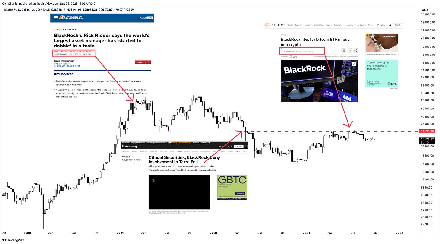
But who could possibly be the Composite Man? Coincidentally, BlackRock began to “dabble” in Bitcoin right around the 2021 top. They did so through BTC CME Futures, potentially shorting the top. Let’s be real, they weren’t buying everyone’s coins back then at peak market prices.
Oddly enough, their name came up yet again around the time that the LUNA collapse occurred. BlackRock and Citadel denied any connection, but did anyone really thing the largest asset managers in the world were going to admit involvement in such blatant market manipulation?
They’ve gone awfully quiet since revealing that they were filing for a Bitcoin ETF, which also coincidentally lined up perfectly with the local top in BTC. If they are indeed the Composite Man, they will at some point in the near future (perhaps not as near as we’d like) reveal their accumulation and cause significant mark up in price.
If they aren’t accumulating, then there is additional fear that such an activity happens only when prices are even lower for the world’s largest asset manager. To be clear, there is no proof tying BlackRock to such events or timing, or any type of accumulation. This is speculation based on the concepts powering Wyckoff Theory and the idea behind the Composite Man and are for entertainment, educational, and speculative purposes.
Until next week, thanks for reading!
-Tony


