


Disclaimer: The information provided in this Substack newsletter is for general informational purposes only and should not be considered as financial advice. Investing involves risk, and past performance is not indicative of future results. Please conduct your own research or consult a financial advisor before making any investment decisions. The newsletter disclaims any liability for losses or damages arising from the use of this information.
Tony “The Bear” overview:
A zoomed-out Bitcoin chart that you won’t be able to unsee once you lay eyes on it
Global M2 liquidity has broken out to new highs – does this mean Bitcoin is next?
Are we about to party in crypto like it’s 2017 all over again? Comparing technical similarities between 2017 and now
March has been maddening for Bitcoin – when will a decision be made about direction?
Plus, high timeframe updates on Bitcoin dominance, altcoins (TOTAL2), and the ETHBTC ratio
Since the inception of this newsletter, Bitcoin has been in a bull market. You’ve only known me as Tony “The Bull.” But that isn’t necessarily because I am a hard-headed bull who charges into any situation. I was trained to stay objective and let the charts do the talking for me. The charts themselves have made it easy to be Tony “The Bull.” During the few pauses for consolidation over the last few years, I’ve advised caution. Over the last few months, I once again became cautious. That caution is turning into outright concern.
I care a lot about my audience. You have been loyal to me, and I aim to be loyal back. I feel responsible for using my training and skills to tell you what I see, regardless of the direction I am hoping for personally. The Tony “The Bull” namesake came about because I want everyone around me to be successful and wealthy. It is very difficult for me to get into a bearish mindset, and no part of me enjoys seeing people lose money or feel fear.
Over the past few weeks, as more and more charts tell me something is wrong with the market conditions, I’ve sounded the alarms to give fair warning in case things get bad. On X, where I post the bulk of my free content, the same reply keeps coming up: “Why don’t you change your name to Tony “The Bear?”
You may notice a this issue is late. This is for two key reasons. One reason was because I did a presentation for the CMT Association on Mass Crowd Psychology that I recommend you check out for more thoughts around Bitcoin reaching a peak. The second reason was because I scoured for high time frame charts that were bullish, in an attempt to counter and balance all the bearish charts I am seeing.
Tony “The Bull” had to capitulate, unfortunately. The bearish high time frame charts outweigh the bullish charts by such a large margin, Tony “The Bull” has been silenced. At least for the time being. There are some potential signs of hope on lower time frames, but the high time frame signals tend to be more dominant signals.
Two bullish scenarios remain, but the window of opportunity for them to come together is fading fast. For either bullish scenario to materialize, bulls need to prevent a further collapse over the next 10 days of March, and must stage a reversal before the end of April. If this doesn’t happen, we could start to see more confirmation of a bear market in the form of downside.
Cannot Unsee
The problem I am having right now, is that I cannot unsee the things I am seeing in the market. I have been in crypto for several market cycles, and have been on both the losing and winning side of cycles. When I lost, I was part of the crowd. When I won, I went against it. A contrarian stance doesn’t always work, as occasionally, the crowd is correct. But at tops and bottoms, the crowd is almost always incorrect.
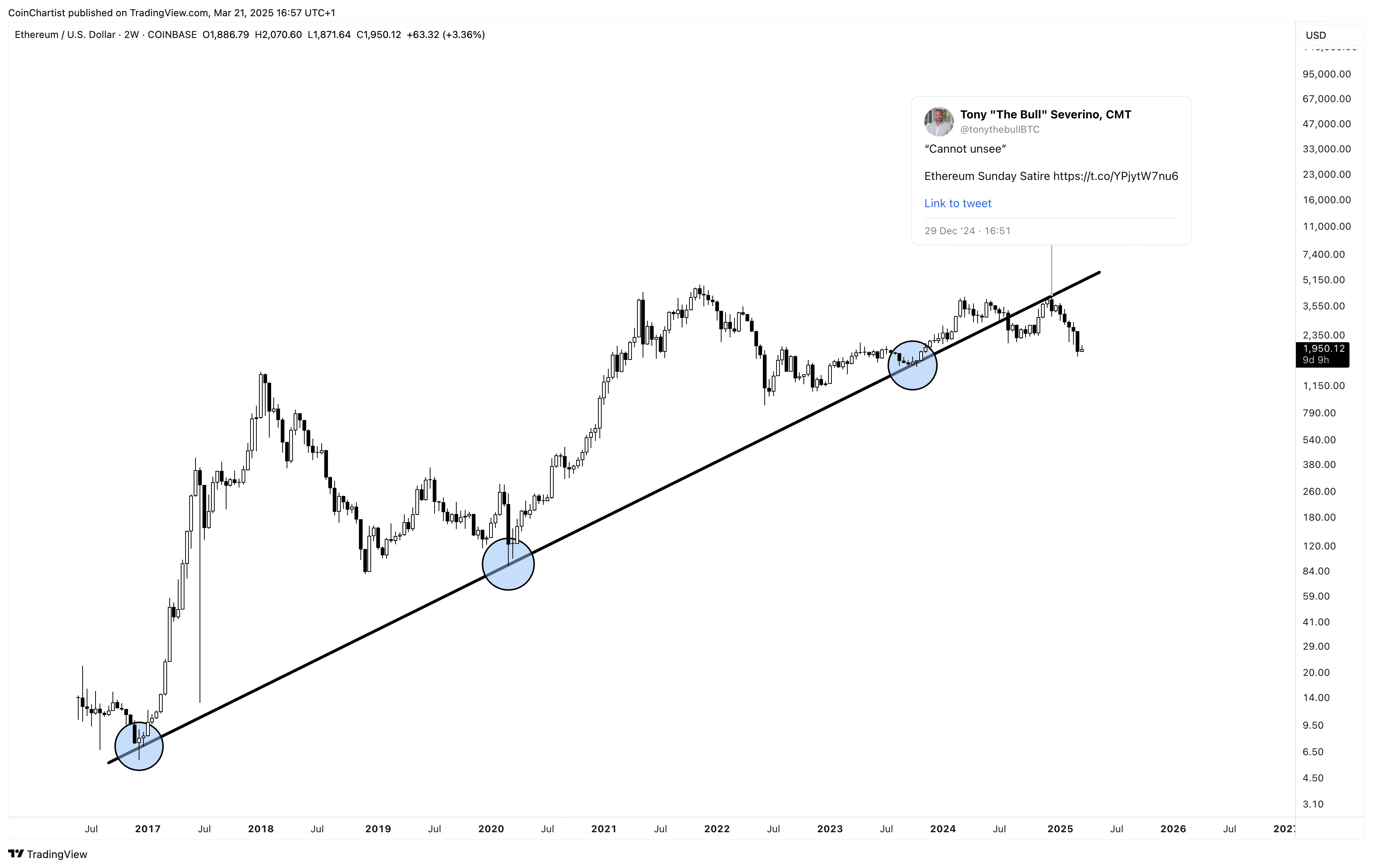
Here is an example of what I am trying to convey. The tweet in the chart above was made on December 29th, 2024. Ethereum was trading at over $4,000 – the exact high for this cycle. It had just made a local higher high, technicals looked good, and there was a bullish backdrop for cryptocurrencies with Trump soon taking office. Things looked so good, although I saw this trend line retest, I chose to ignore this potential signal and went with my original expectations. It was right in front of my eyes, and I chose to label it as “Sunday satire.” Satire is defined as the “use of humor or irony to criticize people’s stupidity.” The only irony here is that I stupidly saw this setup, and wrote it off. Ethereum is now trading for 50% less just three months later.
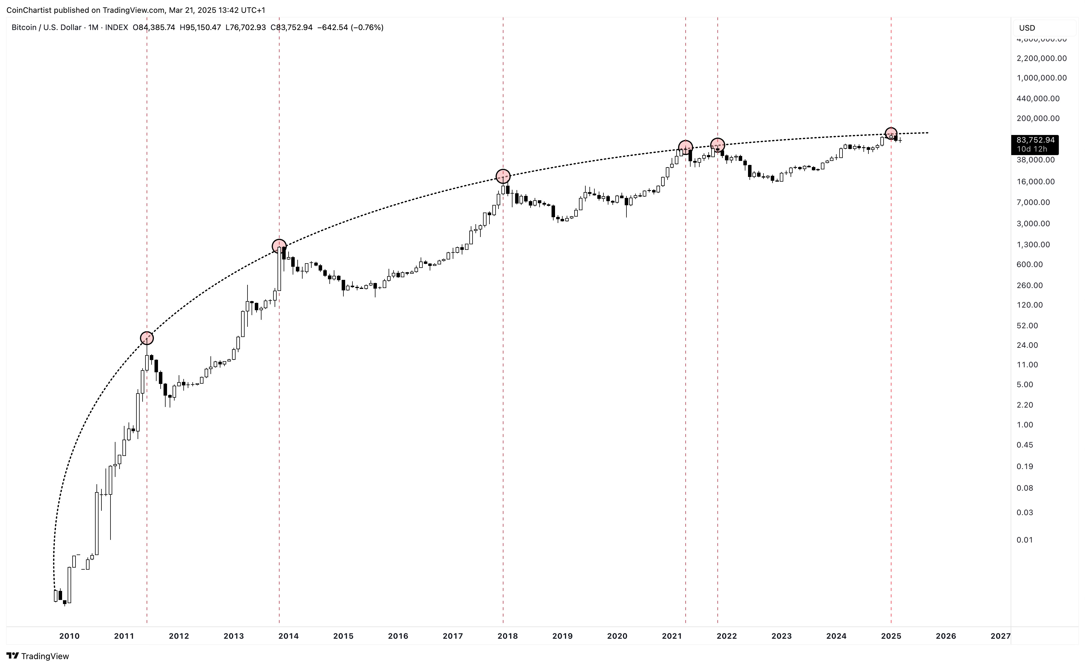
There are a lot of things I see right now that I cannot unsee, with the above chart being one of the most striking to me. Bitcoin’s logarithmic growth curve can be drawn a thousand different ways. A very popular analyst on X who made the log growth curve idea popular in the first place draws it much higher – to the point where Bitcoin never touched it in 2021. In this version above, if you were to draw the lines across every single top in Bitcoin’s history, it projects a peak precisely at where Bitcoin stopped at $106,000. I have to call attention to the fact that just because Bitcoin has stopped here in the past, it doesn’t mean it has to stop here this time. The same ideas I am trying to get across in viewing the bearish side objectively, we need to still be open-minded to bullish scenarios that aren’t like historical norms and past patterns.
Liquid Hopium
If you wanted to get engagement on X right now as a crypto analyst, all you have to do is show everyone the global M2 liquidity chart compared to Bitcoin since mid-last year.
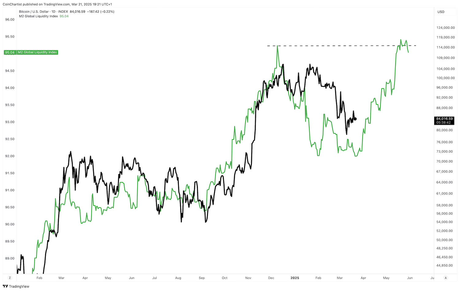
This is the exact chart I am referring to. The black lines are Bitcoin, while green is a measure of M2 global liquidity, which is making a higher high. A higher high is a sign of a continued uptrend. Looking at this alone, I do understand why it is giving people so much hope. The picture makes it appear as though Bitcoin tracks liquidity almost 1:1. Crypto “influencers” are also calling out this higher high as if it guarantees Bitcoin will make a higher high too.
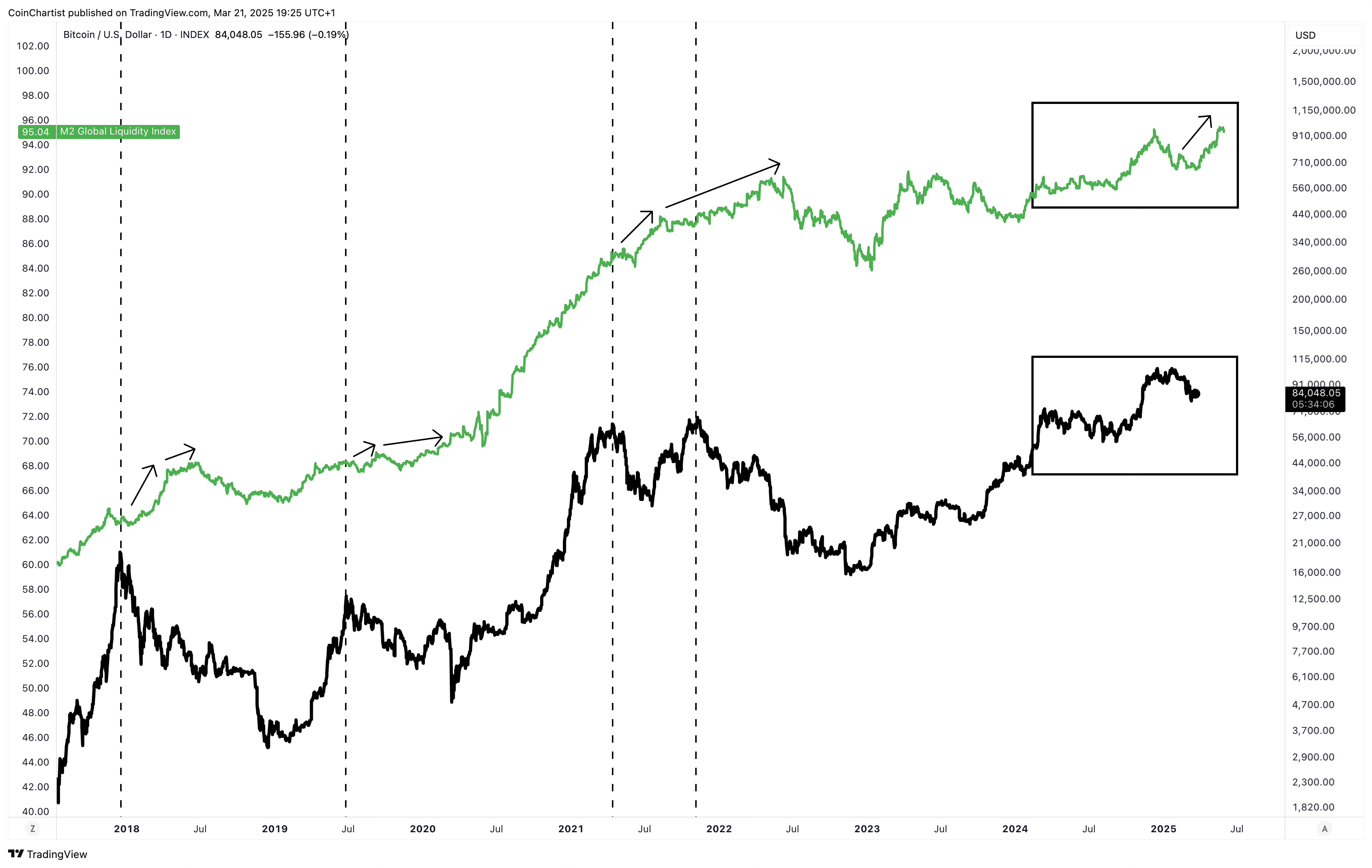
Zooming out to include several important “peaks” shows that global liquidity often rises long after Bitcoin has peaked. This higher high might not mean anything at all. The boxes above represent the first chart you were shown to highlight how these crypto influencers are cherry picking the data in order to provide a hit of what the crypto community refers to as “hopium.”
Party Like It’s 2017
The other popular way to convince the masses that nothing at all is wrong in the market, is to compare Bitcoin now to 2017. I admit, the way the bull market developed the charts look similar if you’re looking at price action only, as you can see below.
Keep reading with a 7-day free trial
Subscribe to CoinChartist to keep reading this post and get 7 days of free access to the full post archives.